Friday, December 30, 2011

Katonah in the City

My new years resolution is a no-brainer. More yoga.

                                                                                                                                                                                                                                                                      
Last year I had the privilege to design a studio for my yoga teacher Nevine Michaan, and her daughter Danielle. Katonah Yoga NYC is located at 17th Street and 8th Avenue.

Nevine synthesized a wide variety of thought, including a healthy portion of Taoism, to develop Katonah Yoga. She and Abbie Galvin, her second in command, break many of the rules of traditional yoga. When I first discovered them up in Westchester I was confused. No shavasana? No coddling? Dialogue all through class? Starting in Pigeon pose? It was not yoga as I knew it. Now I am addicted. They go deep and the effects are profound. 

Katonah Yoga is a hands-on practice. In the image below Nevine has strapped and blocked a student into reverse namaste. She breaks us down and rebuilds with precision. Please also note the morning light streaming through the shear blinds and reflecting off the pickled oak floors! 


I welcomed the challenge to design a yoga studio. For a long time the correlation between yoga and design eluded me. These two great interests of mine seemed far apart. Then, a couple of years ago during a yoga intensive (not at Katonah Yoga) the instructor asked the class where beauty comes from. I am not a huge fan of the soul-searching side of yoga, but I managed to blurt out "order." Which was correct! Suddenly, yoga, which is all about ordering the mind and body, and design which is all about ordering one's life did not seem so far apart.

Katonah Yoga is an exercise in restraint. It is a clean, well-lighted space, ordered down to the last details. There are, however, a few "design moments" in the space like the honeycomb cubbies in the hallway (below) and the tent-like dressing rooms.


I encourage everyone to visit in the New Year. 

Namaste:)


Friday, December 23, 2011

MS Living

Making the holidays magical one chrome truck at a time ...


Saturday, December 17, 2011

Holiday! 2

My friend Roxanne just sent me these pictures of our holiday party.                                        
                                                                                                                                                                
Nicole Renaud transfixed the crowd with a magical mix of opera and accordion. Nicole is both a musical and visual treat. Her  "constellation" dress and accordion light up to great effect.


Here I am with my new favorite moldmaker, Roxanne Mariniello (she took the pics). She and I have been working on a new series of REALITY products. I cannot wait to share our work, but right now it is top secret. She and her husband, Eric, live in Woodstock NY. 


Here Roxy and Eric hang with Harry Allen Design Studio Manager, Shirley Hong, who was looking radiant in her beautiful party dress.


I was too busy socializing to document the party happenings. If anyone else has pics, please send them along.

Friday, December 16, 2011

Holiday!

The Harry Allen Design Holiday Party is the highlight of our social calendar.                              
                                                                                                                                                                       
Much thanks to the Harry Allen Design staff for chipping in, to John for doing the lion's share of the cooking, and to all of our guests for giving it a reason to be. My main responsibility were the decorations. I settled on lots of silver, including my mother's punch bowl (thanks Mom), the original Gran's Candlesticks (all polished up), and some mercury glass fill-ins (from my least favorite store in the world, Pottery Barn, but they really did the trick). Two flying Christmas-ball-red pigs, executed with flair by our intern, Fumiko, took center stage, hovering above the rum punch.


I don't ever want the party to end, and there are always a few die-hards who linger and help ease me out of party mode. Michael Reynolds was one of the last to go, wearing some of the decorations - a boa of fragrant Jasmin flowers. I bet he turned a few heads on Avenue A.


Happy Holidays everyone!

Wednesday, December 14, 2011

Holiday Shopping

I've made pacts with all of the adults in my immediate family - no presents.

Which leaves almost only "ME" on my holiday shopping list. 

I saw these at Paul Smith the other day and could not resist.


Cast from plastic bottles in colorful unglazed ceramic, these vases by Foekje Fleur are right up my ally. John was with me, so I got instant approval. It looks great in our kitchen.


Only needs a flower.

Friday, December 9, 2011

Thank You Mr. Cunningham

Last night John and I caught one of the last ever performance by The Merce Cunningham Dance Company at BAM.


Mr. Cunningham requested that upon his death that his troupe be disbanded. He died in 2009 and The Legacy Tour, the last tour, is wrapping up in NYC in the next couple of weeks. I think the performances are sold out.  I wish I had gotten more tickets.  It is a time of great intensity in the modern dance world and it was palpable at BAM last night.

I'm not sure what it is about modern dance that I love - its three-dimensionality, its humanity, its abstract nature, its physicality - somehow it all adds up for me, and Merce Cunningham embodied the best of it. Last night they performed two pieces. The first piece was called Second Hand, and honestly the atonal John Cage score based on a Satie work really grated on my nerves. There were some beautiful moments, and the Jasper Johns costumes were pretty, but it was a bit boring. The second piece, Biped, blew me away. Cunningham choreographed it in 1999, when he was 80. He was an early adopter of technology, and at this point he had been choreographing on the computer for ten years. Biped employs imagery, captured from his dancers, projected over the live dance. Of course now, the digital age is in full swing, but just contemplate for a moment what I just wrote. He was a pioneer.


The result was layered and beautiful. My mind raced with associations ... his vision of the future is beautiful, man set against a gridded, digital backdrop, the life of the biped still very free and asymmetrical. He was a master of asymmetry ... although there may have been much thought that went into every piece, Cunningham's approach was very aesthetic - moves, costumes, music and set elements exist only to be visually interesting. I have a hard time with that, I always need a reason to create. I therefore try to assign meaning to the elements on stage, but the beautiful reality is that Merce Cunningham employed many elements just because they looked good ... his embrace of technology at 80 astounds me, both artistically and from a personal standpoint. It reminds me of my friend Barney Brown who used and appreciated his iPhone at 90. There is a lesson in that ... the piece, like most great art was at once naive and visionary. Cunningham employed everything at his disposal. The costumes were some sort of holographic material, the projections simple and graphic, the dance rooted in the 20th century modern tradition, nothing exceptional by today standards, yet the the sum total of these parts was transcendent, even today ... the performing arts are fleeting. What change the dancers must be going through. How sad that this exciting era in dance is coming to a close. How sad it is that Mr. Cunningham is gone. I am getting so old. The dancers are so young. There is much promise in the Merce Cunningham legacy. I must go see more dance ... I have finally learned to embrace the wanderings of my mind during a dance performance. That is part of it, like meditation, you just bring your mind gently back to the mantra, to the dancers coming and going, creating beautiful forms, imitating life, relating to one another ... this is art for me.

Thursday, December 8, 2011

More Goddess News

Our Goddess Adorned project made it onto the NY Times blog

Log onto housingworks.org to bid on these one-of-a-kind creations. A whole host of celebrities and designers decorated my Gaia vase, and all proceeds from the online auction will benefit Housing Works. 

Here are some pics from Tuesday night's party at Swarovski in Soho. Ali Tayar was in the house...


... as was John, and my studio manager, Shirley...


... and Gaye Cevikel, owner of Gaia&Gino, seen below with Gisue Hariri, one half of Hariri&Hariri Architects...


So many people were involved in bringing the Goddess project to fruition, but here are four of the main drivers: Vera Klotz of Swarovski, Myself, Gaye, and Jason Morrison of Swarovski.


Needless to say, it was a very glittery crowd...


Tuesday, December 6, 2011

Friday, December 2, 2011

Design Miami #2

Our first stop was Design Miami where we were very impressed with our own work on Mark McDonald's stand. He is carrying an impressive range of American Design from Frank Lloyd Wright to Ali Tayar, Lo-tek, and Harry Allen. Mark has one of HAD's clamp tables on display.


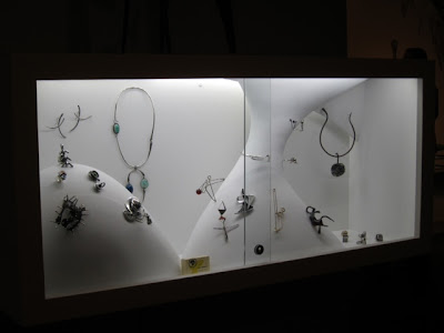
The constrained, organic showcases we designed for his jewelry collection are receiving rave reviews:


More reports to come.

Thursday, December 1, 2011

BOY Book

Tonight are the Best Of Year (BOY) Awards!

My friend Cindy Allen, editor of Interior Design Magazine, is a powerhouse.

She cranks out a great product, Interior Design is one of the last design magazines left standing, and hosts a variety of events throughout the year. I cannot keep up with her whereabouts. Just last month we donated a table to her benefit for The Design Trust, and her two big award ceremonies are this week. 

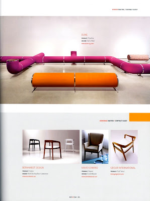
As if the Interior Design Hall of Fame (Friday) was not enough Cindy invented the BOY Awards five years ago. And now she has turned the BOY Awards into a beautiful glossy book featuring the award, that we designed, prominently on the cover!


And if that was not enough, we won last year for our Pipeline Seating system and it is featured on page 295!


Wednesday, November 30, 2011

Design Miami #1

The H&dM garage was on fire last night with a Ferrari event. It is the best building in Miami.

Monday, November 28, 2011

Design Miami 2011:

Clamp Table offered for sale at Mark McDonald (we also designed his exhibition space).


If I do say so myself, my Clamp Tables never looked fresher. They are the culmination of my early work with systems and new materials, . The striped motif is not just surface decoration; it is derived from sheet materials that are clamped together in a stack. The inherent beauty of the industrial materials - baltic birch plywood, medium density fiberboard, parallam, and colored acrylic - are emphasized when they are combined in this manner.  The stainless steel base, includes a clamping mechanism that references the art of furniture-making. Wood it is often glued and clamped temporarily during fabrication; here the clamp becomes the final method of assembly.

When I developed this series I was only a few years out of school and I had been clamping and gluing a lot in the studio - making furniture and industrial design projects - so the bar-clamp was sort of an iconic and ironic reference. I thought it was beautiful, and I wanted to just keep it in mix rather than remove it. I had also been advised that it was hard to glue various plastic and wood together, so a mechanical fastening device made sense.

Mechanical fastening also allows for changes in configuration and materials. Although the Clamp Table is systematic in its design, each is produced on a one-off basis. The original series was exhibited in a show entitled Comply, in the Harry Allen Studio, in conjunction with the ICFF in New York in May of 1997. It has since been modified for production. Clamp tables are produced by the designer on a custom basis, and are available in various sizes, materials, and configurations.

The Clamp Table is in the permanent collection of the Brooklyn Museum of Art.

Saturday, November 26, 2011

LA PIG

My press hungry pig made an appearance in the LA Times today.
                                                                                                                                                                      

Thanks to my friend Carson for the spotting and laptop photo!

Thursday, November 24, 2011

Color Report: Thankful Red

My travels this month took me to Sewla, a monastery high in the Bhutanese Himalayas.                    
                                                                                                                                                                   

I am very thankful to our friends Michael Reynolds and Eric Hoffman for bringing us on this incredible journey. We hiked 5 hours, uphill, to get there. We stayed at the monastery for two nights and despite the simple life the monks lead, it was a sensory immersion for this designer from New York - the chanting, the silence, the stars, the butter candles, the incense, the mountain light, and the honest food.  It was here that I found my new favorite color, the deep burgundy red of the monk's robes. It is a color that will never look the same to me again. Morning and evening prayers featured a sea of red robes set to a score more minimal and haunting than a Phillip Glass symphony.


The red played beautifully against the minimal  Himalayan backdrop for music practice.


This deep shade of red is now, to me, the color of compassion and duty. While I was travelling a good friend became very sick. Edward James (Barney) Brown was an artist, an art restorer, and one of the most magical people on earth.  My new friends at the monastery helped me honor him by hanging some prayer flags. As they wave, the flags are said to send prayers out over the mountains and valleys. 


Barney was not very religious, but I am sure he would have been inspired by the monks, in their red robes, helping us hang the colorful flags. Barney might have gotten out his water colors and done a painting of the red robes or the flags waving. Barney died on November 13th, as I was returning from my trip. 


I know a thankful red color story is a bit of a stretch, but somehow it made sense to me. Color takes on meaning. This year, in addition to the myriad of things I have to be thankful for on a daily basis, I wanted to give a special shout out to the red monks of Sewla for their hospitality and thoughtful ways. I also wanted to thank Barney for everything he taught me about art, and color, and enjoying life. Happy Thanksgiving everyone.

Monday, November 21, 2011

Jet Lag

My return from India and Bhutan resulted in major jetlag. Last week is a blur but we managed to take in a lot of NYC culture.                                       
                                                                                                                                                                  
Monday: I hit the ground running at the Museum of Art and Design Gala dinner at a table hosted by Kris Fuchs and Maria Sepulveda, my friends at Suite NY. It was a fun event, they kept the award ceremony short and let people have a nice dinner. The only picture I took, of Holly Hotchner, the Director of the Museum, on the big screen monitor presenting an award, does not do the evening justice. Even in my jetlag I had more fun than this. I am sorry I did not get a pic of Vladimir Kagan receiving his award, or of my fun table mates.


Tuesday: We cooked dinner for friends and had a little toast to the passing of our friend Barney Brown. The Magic will be missed.

Wednesday: I completely forgot we had tickets to the 9/11 Memorial :( But we did get some rest.

Thursday: For some reason I felt it would be a good idea to get John Jasperse tickets at BAM. John and I love modern dance, but the evening just fell apart. The Wall Street protesters held us up, we didn't have time for the adventurous meal in Ft. Greene we had planned, and we ended up sleeping through the whole dance piece. It looked interesting, between nods. Lots of fluorescent tape. The NY Times gave it a nice review. I think. The piece had very few points of engagement. As you read the review, just imagine trying to stay awake ...

Friday: John made some very hot Tortilla Soup.

Saturday: Finally coming out of the haze we caught Melancholia, Lars Von Trier's epic new film featuring a hauntingly beautiful Kirsten Dunst. I am still processing it. Scary and beautiful. I didn't immediately love it, but I woke up thinking about it on Sunday morning and it colored my whole day. It is a powerful fantasy.


Sunday: We saw a great production at NY Theatre Workshop in the hood on 4th Street. It is a stage adaptation of Once. The movie was a folk cult sensation a few years back and I love the music. Now it has been set for the stage. At $75/head, with Broadway aspirations, in this perfect little theater, with a bar set up on the stage and a dozen very talented musical performers I would say run-don't walk to get tickets for the holidays!


Friday, November 18, 2011

Harry's Travels: Bhutan #2

I will be boring friends for a long time with my pictures of Bhutan. I've seen so many beautiful things. One of my favorites was this Geometric Poem. The grid motif appears repeatedly in Buddhist temples, and God knows I love a grid, but here it's coupled with text and apparently it reads in all directions. Our guide could not read it because it is written in an ancient language, but the concept and the resulting pattern are mesmerizing. Like an ancient, holy crossword puzzle.

Tuesday, November 15, 2011

Harry's Travels: Bhutan #1

We landed in Paro, Bhutan last Friday, sorry about the late news, but Internet has been spotty. We spent our first morning visiting Tigers Nest (Taktsang). It is two hour plus hike up to see this spectacular temple. It appeared out of the fog dramatically. It is a fully functioning temple and we attended our first of many Bhuddist prayer ceremonies in one of its small shrines.


On the way up we passed this little retreat cottage, tucked in a ravine. I love the intersection of the simple cubic form and the rocky landscape. This is a retreat house, where a monk will go for three years and three months to contemplate and pray.

Friday, November 11, 2011

Katonah Yoga NYC

Visit our latest interior project at the grand opening of Katonah Yoga NYC this weekend. Free yoga and Pilates classes!


Don't miss out on a free class - they're filling up quickly!

Tuesday, November 8, 2011

Banana Bowl Spotting

The Banana Bowl for Areaware was spotted in "Miami Marvel" of Elle Decor.

Thursday, November 3, 2011

Harry's Travels: India #2 Color Report

As luck would have it, we arrived in Varanasi just in time for Chhath.

Varanasi is the holiest Hindu city on the banks of the Ganges River. The sights have been amazing and we hit it right for Chhath, a festival during which women make offerings to the sun god in honor of their sons. We were up at 4:30 this morning to fireworks and thousands of women lining the banks of the river with baskets of fruit and flowers and incense. It was beautiful. Most of the women wear fluorescent orange stripes on their foreheads in addition to their bindis.


It all made sense when the sun appeared above the river.


I am in awe of India's spiritual use of color.

Wednesday, November 2, 2011

Harry's Travels: India #1

I am in India on my way to Bhutan. Nothing humbles your design sense as much as a trip to India. Design is all about control, India is all about letting go.

As much as any designer, maybe even more, I am comfortable embracing the reality of things. Life is random and sometimes going with the flow enables some incredible results. No country does random as well as India. Our first stop was the Hanuman temple in Delhi. Out front they sell flower garlands. The garlands are used to adorn everything from stores, to cars, to temples. The world needs more flower garlands, it is such a beautiful gesture. And to my Western eyes it seems so decadent; they will after all, just decay; but herein lies the beauty.


India offers many examples of random embellishment. Note the tassels on this banana truck.


There are many lessons to be learned here. One of the things I noticed today is how many components go into an experience. The atmosphere, the smells, the sounds. We visited Agra today and the Taj Mahal was splendid. White on white marble, in a smoky haze, lit by a setting sun, and hoards of visitors, a sea of humanity, paying their respects.

Monday, October 24, 2011

Monday Cocktails

My first ever Cocktail Table is complete.


I got it back yesterday from the sandblaster. I am putting the prototype up for auction in the 2011 Design Trust Art + Design Benefit Auction that Cindy Allen, the Editor of Interior Design magazine, organizes every year. This small table (14" x 14" x 17") will complete any room. Look for it on their website soon (I'm a little bit late with my entry), and bid on it there, or you can attend the event and bid live. It is a fun evening.

There will be more Cocktail Tables to come, they are part of my REALITY work. In this series, instead of casting from life, I re-use the vestiges of our lives. The Can Clusters I created a few years ago are a similar idea. Waste transformed through order and finishing.

To me, these liquor bottles connote good times, some may see danger and sadness in them, others may relate to the particular brands, or just to the iconic nature of bottles in general. Whatever the association, meaning is latent decoration. The beauty, however, is not fully tapped until the artifacts are ordered and finished. In a batch of random bottles there are many sizes and shapes so each one of these pieces will be unique. This table for example employs all rectilinear bottles and I was amazed at how this selection went together as a perfect square. I had them sandblasted to get them one step away from reality.

There is much potential in trash. These bottles are extremely structural, reuse redeems the energy that went into making them, and prevents the energy needed to recycle them. However, reusing waste is not as easy as it sounds. Production is much more difficult than I had imagined. For the moment, my cocktail tables will all be unique creations. Of course, not every bottle will do, so I dumpster dive at our local recycling center selecting only clear liquor bottles, clean them, and arrange them. They are
sandblasted and UV glued together. The tops and bases are solid virgin glass. I have always been a proponent of mixing reused and new. Silicone stoppers and bumpers complete the table.

Friday, October 21, 2011

National Design Awards 2011

I Attended the National Design Awards last night and it was feeling very "establishment."                                                                                                                                   


The room was fun, designed by David Stark (again), and I sat at a cool table. Chris Hacker (L below) hosted. He is a friend and one of the best art directors I have ever worked with (Aveda, J&J, Steuben, Warner Bros). In addition to friends and colleagues he invited his 95 year old father, who was the star of the evening. 


Congratulations to all of the winners, but the ceremony was long-winded and it seemed like the big guys took over this year. I know, where would we be without the big guys, but some years there are a few underdog winners too. Natalie Morales hosted and Sigourney Weaver presented an award, so there was some star power in the room. Mathew Modine presented one of the last awards and commented on how dry the room was. 

One cannot be too judgmental, it is a charity event and there are probably a whole host of forces at work that I will never understand, but it is the National Design Awards! Where was the design? Where were all of the designers? We need to shake this party up.

I did run into my friends from the Corning Museum of Glass. They had made the award. It is pretty beautiful, check it out here.