Wednesday, July 27, 2011

CONVERY TAPE-SCAPES

If you are in Provincetown, MA on Friday evening (7/29), check out my friend Tim Convery's new work from 7-10pm at Foc'sle, 437 Commercial Street.

Tim is a graphic visionary, and last weekend he gave me a preview of his new work. The poster-sized artworks are rifts on travel posters. They are constructed of colored duct tape and employ traditional 2D design mediums (now lost to the computer) like acetate overlays and hand cut graphics. They reminded me of Matisse, but upon closer inspection they are even more gridded out than Swiss-school posters. 

Back in the 90s, Tim and I worked at Prescriptives cosmetics together. He has an amazing sense of style and beauty, and I learned alot from him. One of my criteria as I design is often, "what would Tim think of this?" It is a high bar.

His new body of work is smart and compelling. I loved them so much that I bought one. I hope to bring some of this work to the Harry Allen Design Showroom in the fall.

Monday, July 25, 2011

Home Decor Trends


Our LOT Dining Chair and Banana Bowl were recently featured in Homedec. Homedec is a quarterly magazine published in Malaysia. 

Wednesday, July 20, 2011

The Prince and the Pig

I'm so happy when my products are adopted into good homes. This little gold pig won the lottery: New York Social Diary 

Monday, July 18, 2011

Core 77 Design Awards Results


I was a juror for the Core 77 Design Awards in the Products and Equipment category. The results will be broadcast live today at 4pm EST a Core77 Design Awards.

Friday, July 15, 2011

Color Report

I love this image for a few reasons.

1) It demonstrates how well our platinum grey kitchen sets off other colors.

2) I believe in design dialogues and I love when two inanimate things in my life start communicating. Our rosé was definitely talking with our snapdragons this evening.

3) In order to really appreciate a color you need to dance around it. On first glance these snapdragons are orange, but when you get into it they are yellow, orange, and light pink. The wine's subtle blush color and transparency compliments the flowers beautifully. Sometimes it is nice to experience a color in all of its variations.


Thursday, July 14, 2011

Thomas Dybdahl

I thought everyone knew about Thomas Dybdahl, the young Norwegian singer-songwriter. I raced to get tickets when John's brother called from Norway and told us he would be performing at the Mercury Lounge, but they were still selling tickets at the door.


It turned out to be one of those amazing NY shows where you feel very special. The Mercury lounge wasn't crowded and the music was incredible. The show only lasted an hour, but it only cost $15 and he played many of my favorite songs. Only a couple of new songs were thrown in to whet the appetite.

I love the performing arts for their temporal quality. Design is often very static, but every time music is played it is different and the audience reacts anew. Having only ever heard Dybdahl's recorded songs, the live performance took on a new life. I was surprised by the human interpretation, and I heard lyrics I had never heard before. 

Concerts like this make me realize how different design is from the other arts. I'd love to design things that engage the user like music. To design a chair that stirred emotions, that made people sway, weep, and appreciate life in all of its complexity. Many designers have tried, but it always seems sort of forced. Design as an art form has its limitations and maybe it is best to keep it simple, to restrain ourselves, to be content accommodating others. All I know is that when I put on Dybdahl, he goes beautifully with everything. He even when well with the beer stained floors at the Mercury lounge.

However, there is one more interesting design fact about Thomas Dybdahl. A couple of years ago Philippe Stark, fell in love with his music and offered to art direct the album Science. It wasn't my favorite album musically, but it had a very nice cover. 


Wednesday, July 13, 2011

Culture Breakfast

I saw 3 unique shows this morning with Kurosaki-san - Alexander McQueen, even more amazing the second time around - the Richard Sera drawings at the Met, the antithesis of McQueen, but no less incredible - and Stephen Burkes' "Are You A Hybrid?" at MAD - a very contemporary commentary on the new world order of design, a great edit. My mind is still processing it all.


Kurosaki in NYC

Teruo Kurosaki is a friend of mine from Japan. I always refer to him as a design impresario, which he is. For years he owned a store in Japan called Ideé - they produced my Daylight lamp and were one of the original distributors of my REALITY series. 


Last night we had dinner at Momofuku with his nephew, Coby, designer Stephen Burkes, and Coby's girlfriend, Carrie. 

Kurosaki has been a mentor and supporter to many product designers. These days he is less involved in design, and more involved in design culture. He is working on the branding and design direction for some big developments in Tokyo and Hong Kong. It was nice to meet his family, and good to see Stephen, who in addition to being one of NYC's finest designers has a show up at the MAD that he curated called "Are you a hybrid?"


Sunday, July 10, 2011

Big Green & Big Red

John has been lusting after one of these for a while now, but this weekend he took the plunge. The Big Green Egg is the Rolls Royce of outdoor grills. 


Admittedly it is a yuppie grill fantasy, and from an aesthetic point of view it is sort of funny looking, but its beauty is in its function, and in John's hands it will be well used. We've already had smoked ribs (Fri), and smoked chicken (amazing on Sat eve) and some grilled steak tonight. Based on a traditional asian Kamado, the BGE is ceramic inside and out, like a little kiln for your food. It smokes beautifully, and the ventilator on the top allows for efficient cooking at accurate temperatures.

And nothing goes better with some BGE cooked steaks than a robust bottle of Meerlust Rubicon from the Stellenbosch region of South Africa. We visited the winery a couple of years ago and just found it at our local liquor store. Yum, and such a classy label.


Thursday, July 7, 2011

Color Report

It's a roadside weed, but what a beauty.


The pale blue violet  flowers of wild Chicory (Cichorium intybus) line the roads near my home in Bedford NY at this point in the summer. It is a color sure to induce nostalgia.

When I was kid, we called this plant Flax. I only just now learned via a web search that it is in fact Chicory. This explains the murky results I got from an attempt to make linen. Somewhere I learned that linen was made from Flax plants. Further research revealed the manufacturing process that involves soaking the dried stems in water. Apparently if Flax plants are used, the process dissolves the pithy part of the plant and leaves the linen fibers. If one uses Chicory it just makes a smelly bucket of goo.

My childhood disaster notwithstanding, it is a color I would love to use on an interior project at some point. I see it paired with dark woods like Walnut, or a dark steely gray.


Friday, July 1, 2011

McGenius

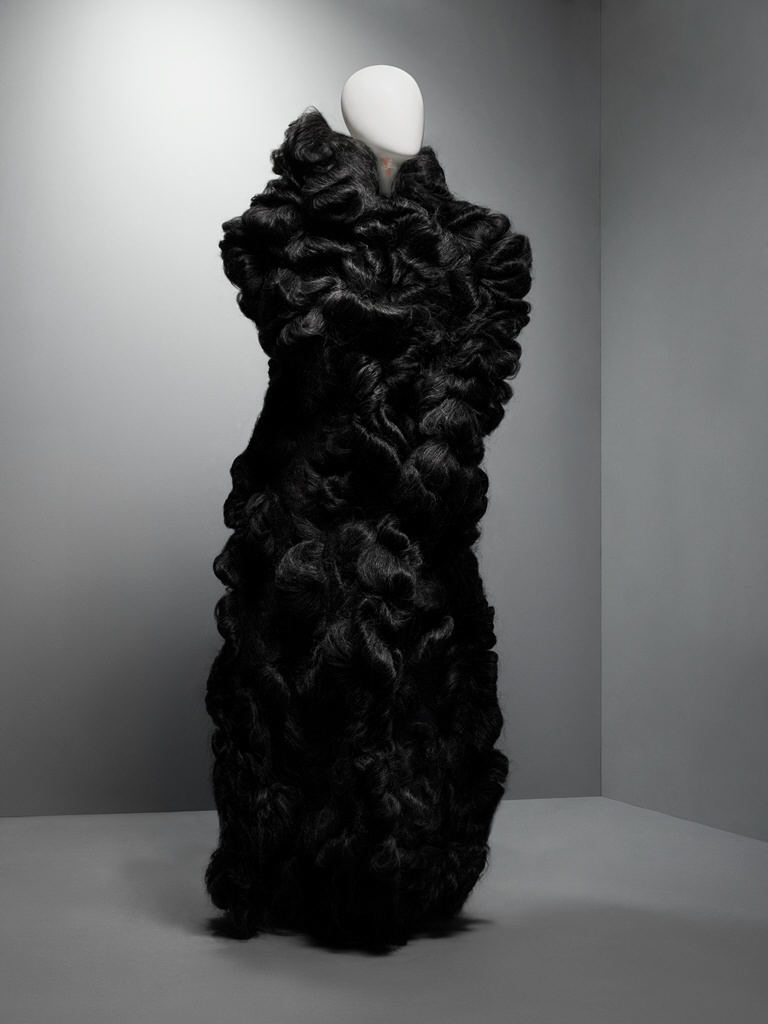
Alexander McQueen @ the Met blew my mind.